Overview
To enhance clarity and scalability in our shop design, our team conducted an A/B test using Optimizely for live testing and Maze for pre-launch user testing. While we anticipated improvements in user decision-making, the results revealed unexpected shifts in purchasing behavior, prompting deeper analysis and future strategy adjustments.
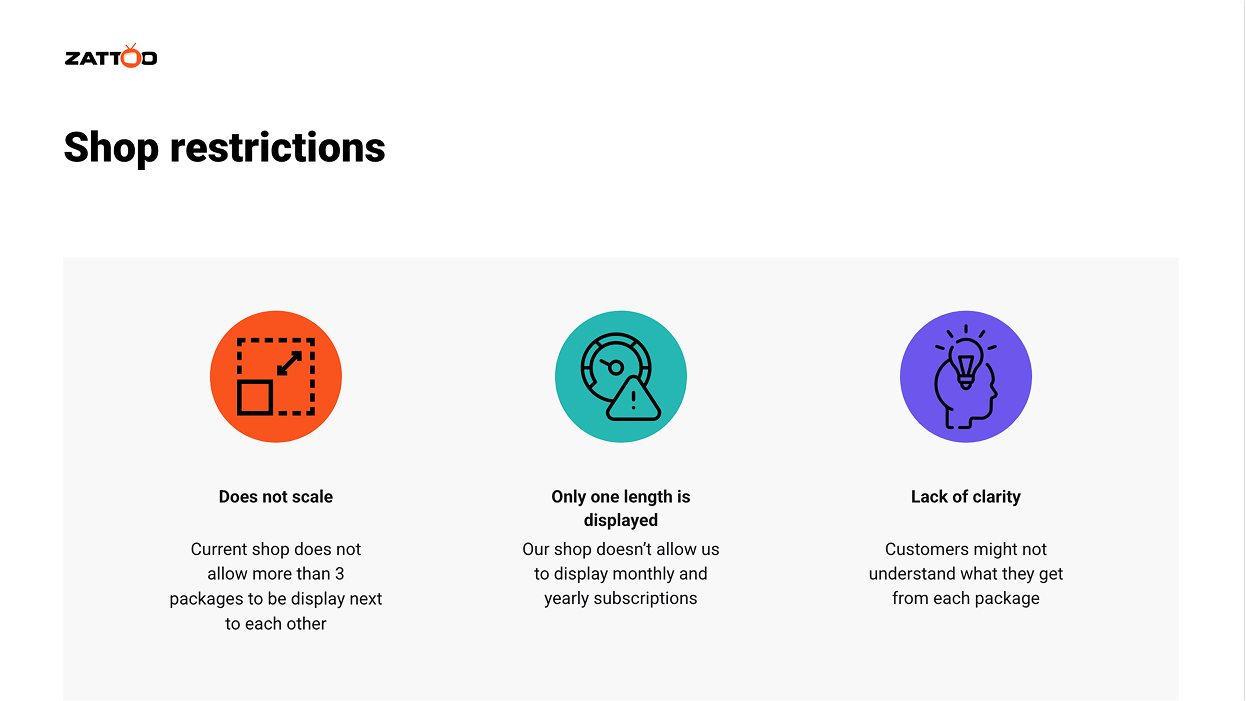
Problem Statement
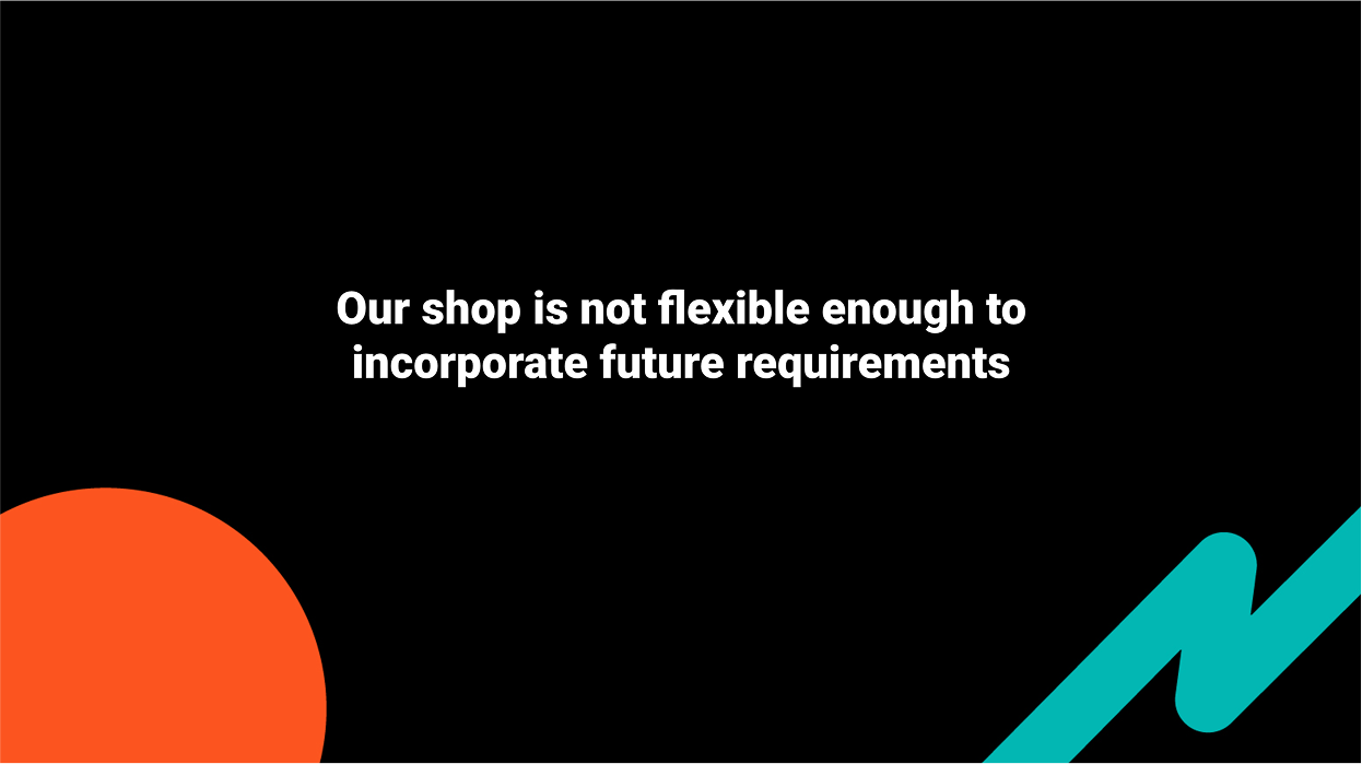
Users struggled with understanding package options, and the existing pricing table lacked flexibility for future scalability. We aimed to increase clarity and usability, ensuring users could confidently choose the right package while maintaining or improving conversion rates.
Approach
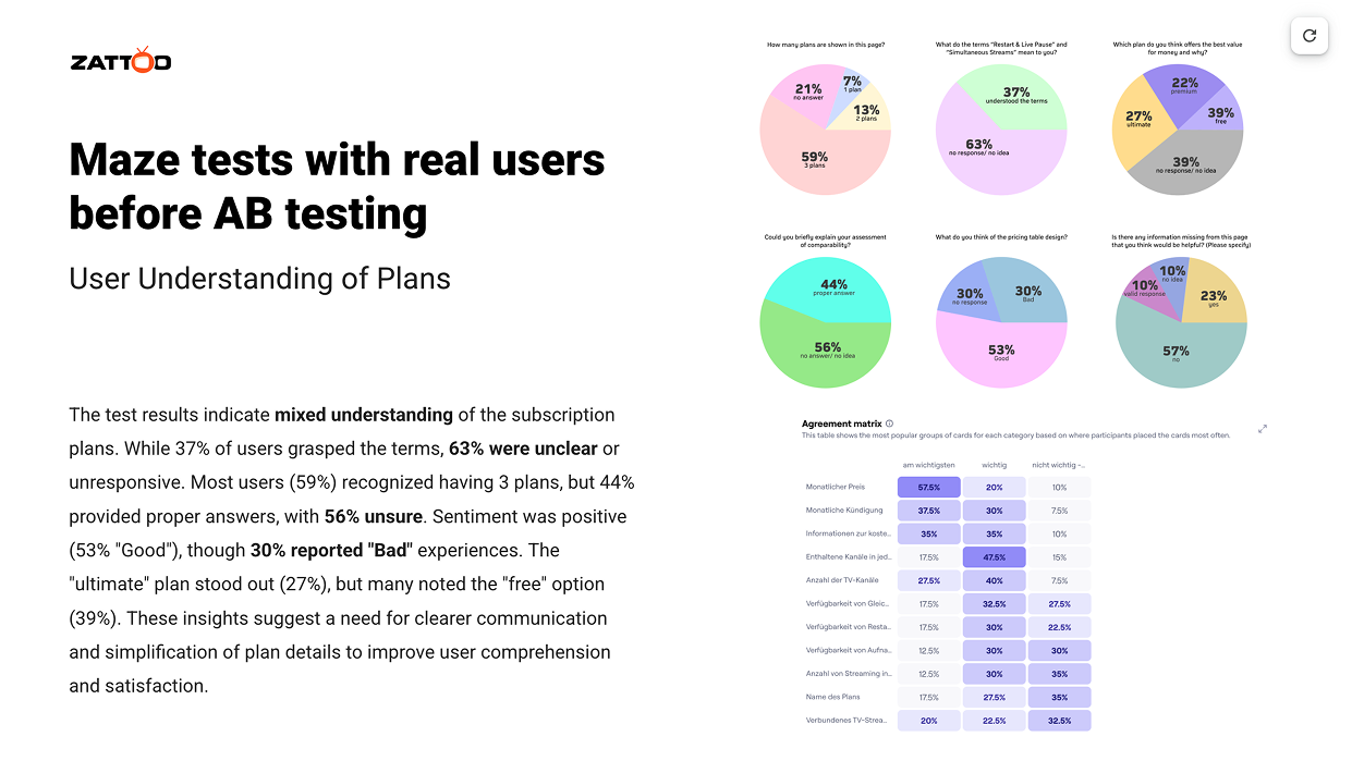
1/ User Research & Testing: Maze testing identified key pain points related to readability and navigation
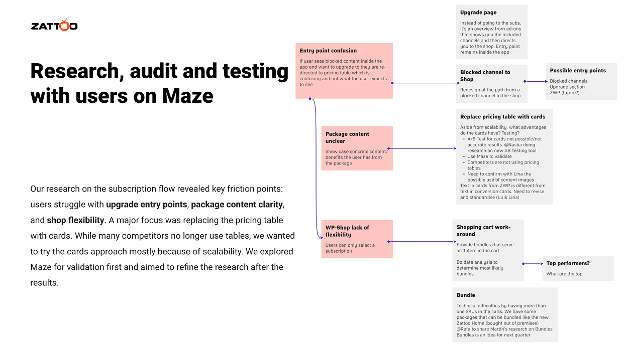
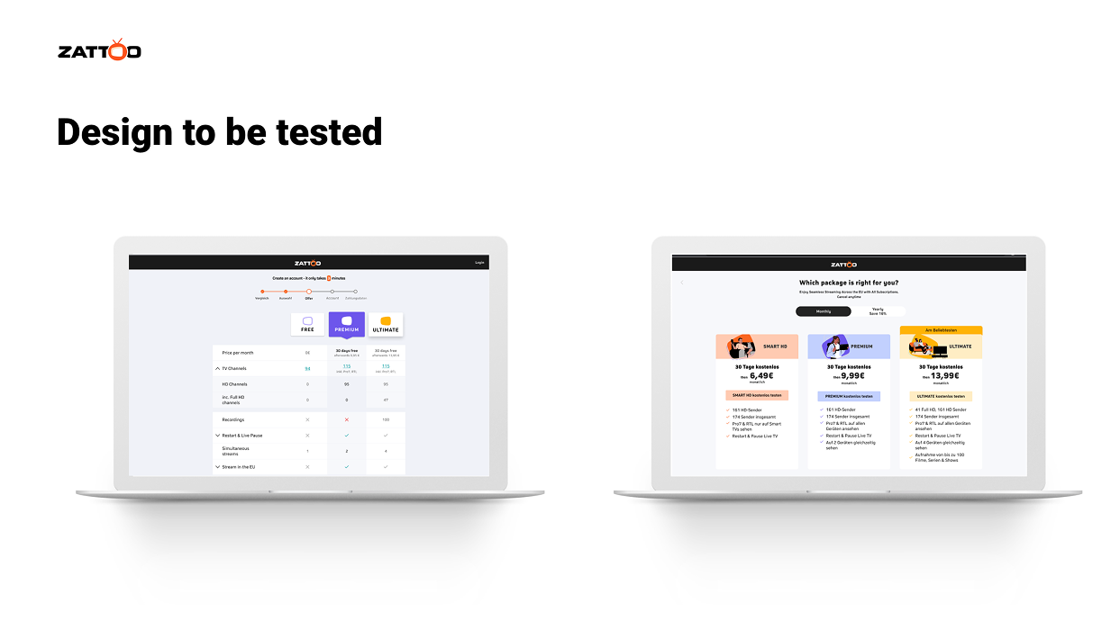
2/ Design Solution: We introduced a card-based layout to replace the rigid pricing table.
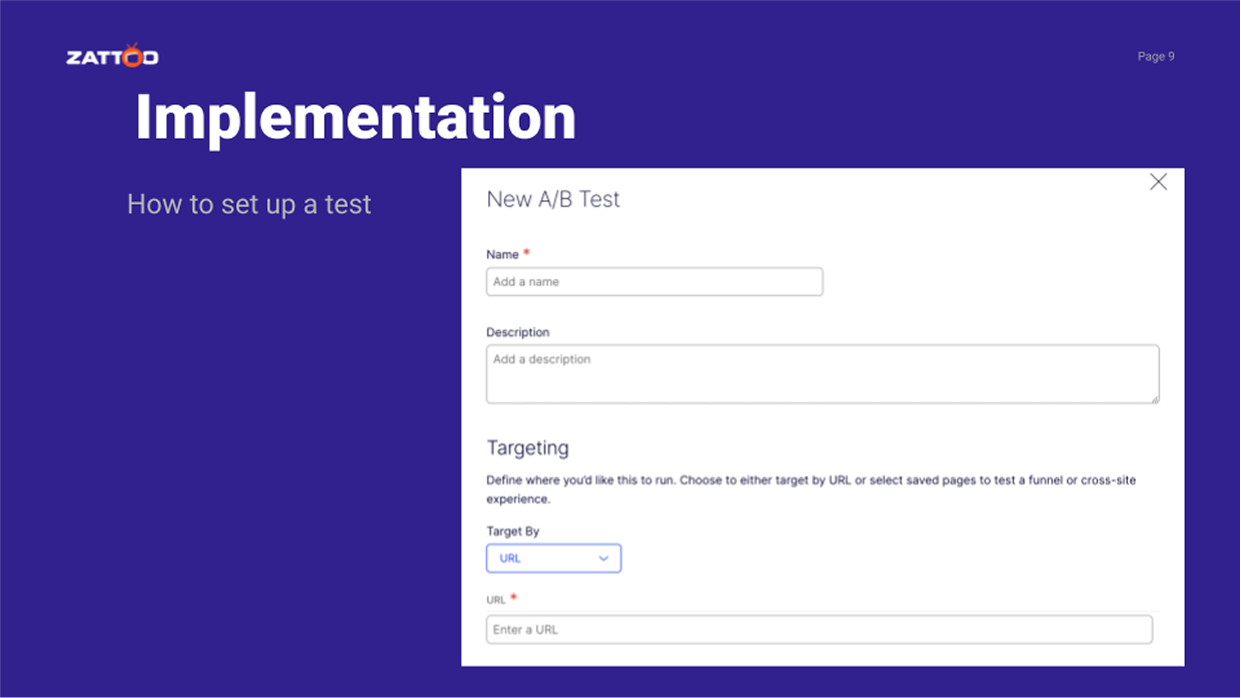
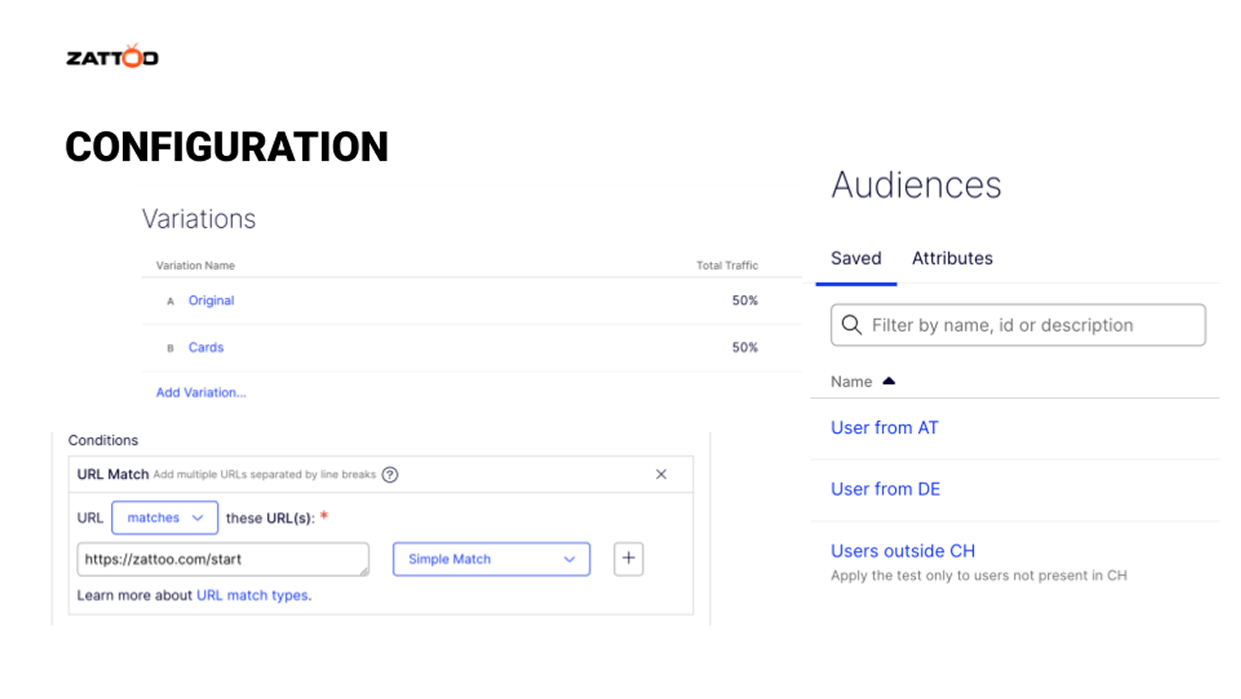
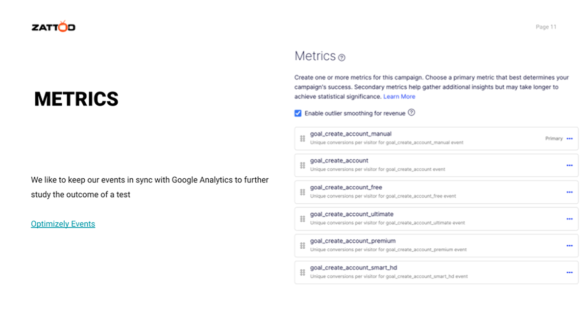
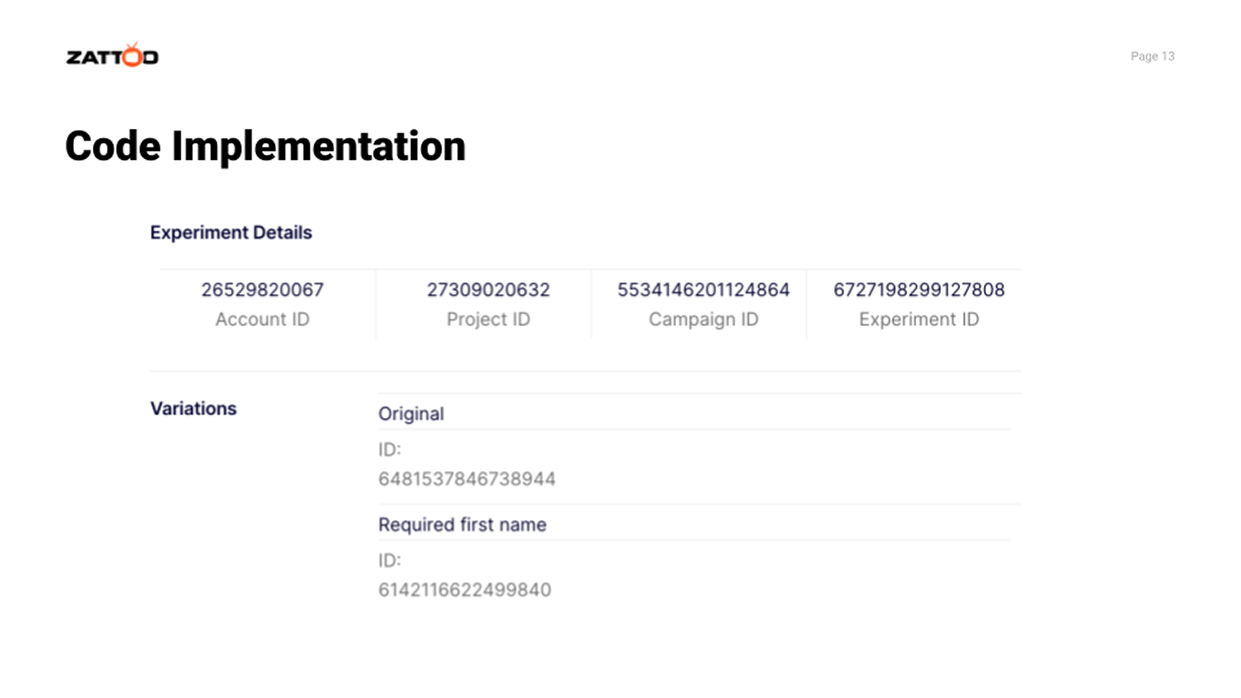
3/ Implementation & Experiment: A/B testing was conducted via Optimizely, tracking total purchases and product-specific selections.
Challenges & Learnings
🔹 Multiple Design Changes:
Simultaneous modifications made it difficult to isolate which elements influenced behavior.
Future tests should focus on incremental A/B testing for clearer attribution.
Future tests should focus on incremental A/B testing for clearer attribution.
🔹 Test Duration & Data Considerations:
The test ran for one month, but variations in traffic patterns suggest that a longer timeframe may be necessary for more reliable conclusions.
Additional data points, such as desktop vs. mobile traffic and pre-selected package influence, should be considered.
Additional data points, such as desktop vs. mobile traffic and pre-selected package influence, should be considered.
🔹 Clearer Goal Definition:
Aligning on a primary success metric before testing ensures more actionable insights.
Key Findings
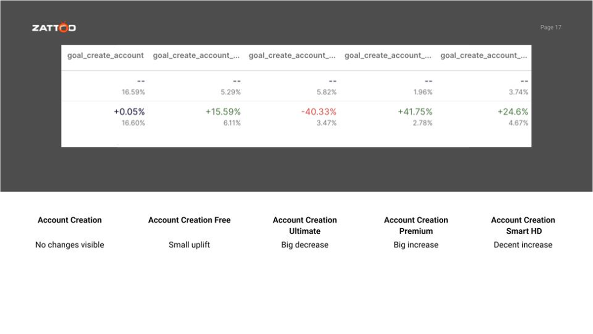
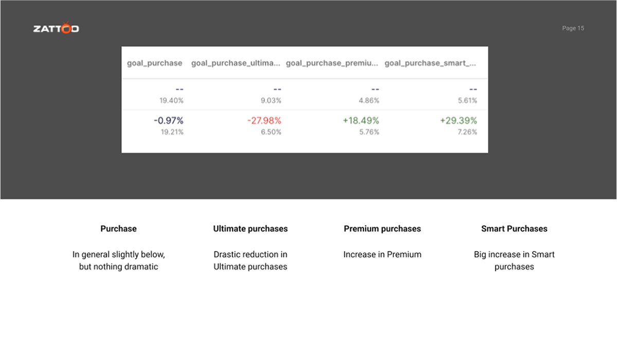
✅ Total Purchases Unchanged: The redesign did not negatively impact overall conversions.
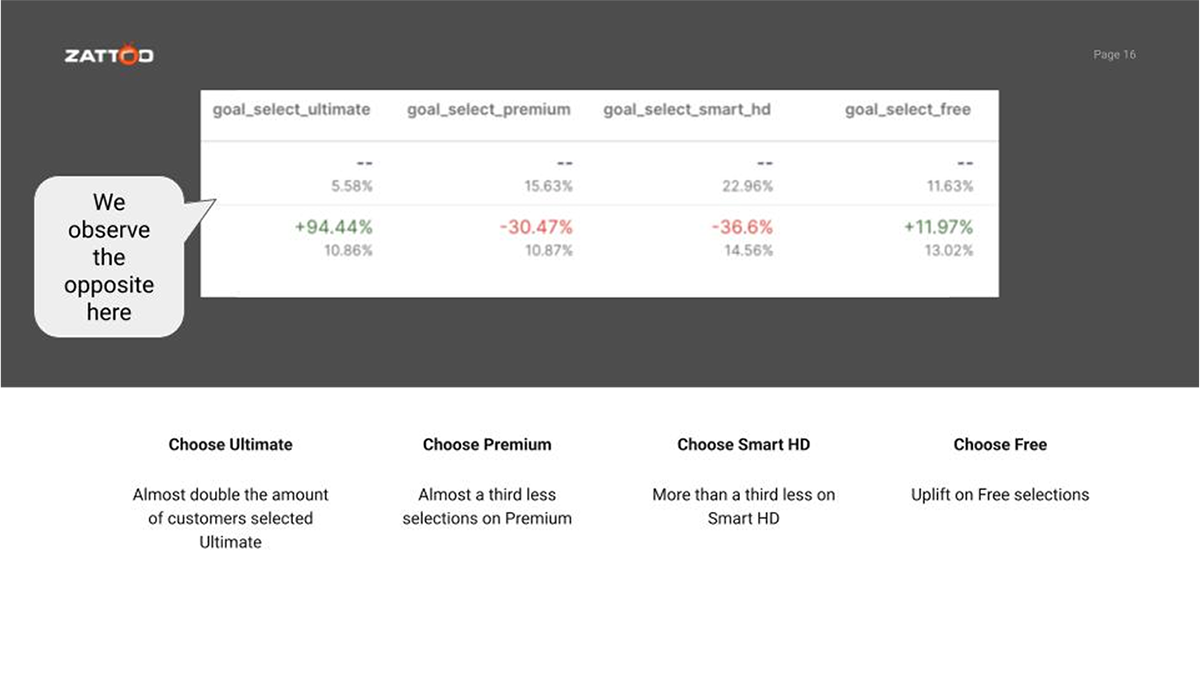
⚠️ Unexpected Package Selection Shifts:
⚠️ Unexpected Package Selection Shifts:
Purchases of the "Ultimate" package decreased, despite an increase in initial selections.
Sales of "Premium" and "Smart" packages increased instead.
Sales of "Premium" and "Smart" packages increased instead.
🔍 Interpreting the Results:
Users selecting "Ultimate" initially dropped off at later stages of the funnel.
The new design may have been too efficient, leading to rushed decision-making.
A possible lack of a secondary call to action might have discouraged final conversion.
Users selecting "Ultimate" initially dropped off at later stages of the funnel.
The new design may have been too efficient, leading to rushed decision-making.
A possible lack of a secondary call to action might have discouraged final conversion.

Next Steps
✅ Conduct deeper user behavior analysis, focusing on drop-offs in the "Ultimate" selection journey.
✅ Test individual design changes incrementally to pinpoint impact more accurately.
✅ Implement stronger calls to action to guide users more effectively through the purchase flow.
✅ Extend A/B testing windows to capture long-term trends and ensure data validity.
✅ Test individual design changes incrementally to pinpoint impact more accurately.
✅ Implement stronger calls to action to guide users more effectively through the purchase flow.
✅ Extend A/B testing windows to capture long-term trends and ensure data validity.
Conclusion
This experiment reinforced the importance of iterative design changes, data-driven decision-making, and ongoing testing to refine user experience. While the redesign improved clarity, addressing unexpected behavioral shifts is key to optimizing the funnel for long-term success.